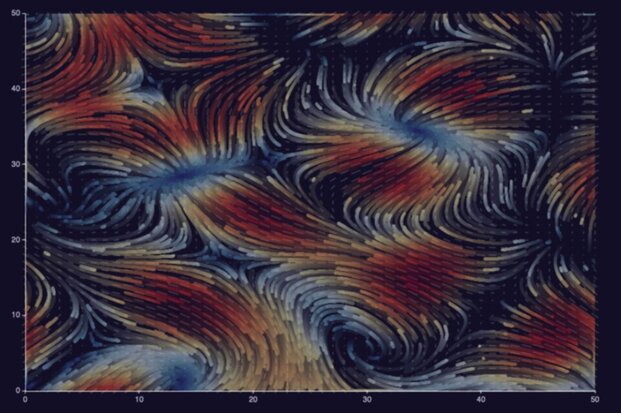
A love letter to Apache Echarts
In the world of software development, I believe the 7th circle of hell is called “NPM”. It’s a place where you can find Javascript libraries that make great promises only to disappoint you once you actually import them. I know this because I even wrote one.
When you find a gem hidden in this pile of garbage, it is important to tell the world about it. So, I am here to tell you how much I love Apache Echarts.

What is this Echarts thing about?
Apache Echarts is a data visualization library made by researchers from Zhejiang University and Baidu. It provides developers with a declarative language that helps you render charts to canvas or SVG elements.
What makes it stand out from other charting libraries is that it manages to cover a very wide range of use cases while remaining simple to use. On top of that, the documentation never failed to point me in the right direction. And most importantly, the results look good and are interactive.
A few examples
Bar chart
To get started, let’s do a simple bar chart of the stars in my GitHub repositories in 20 lines of code.
Source code
const bar = echarts.init(document.getElementById('bar'));
bar.setOption({
  legend: {},
  tooltip: {},
  dataset: {
    // dataset.source contains your data in table form
    source: [
      ['repo', 'stars'],
      ['Mikochi', 129],
      ['crud_benchmark', 40],
      ['sql-repository', 7],
    ],
  },
  xAxis: {
    // category will use the first column for the x axis
    type: 'category',
  },
  yAxis: {},
  series: [
    // this creates a bar chart
    { type: 'bar' },
  ],
});
Financial chart
If like me, you enjoy playing with financial data, you might be used to more complex charts. Echarts lets you easily combine multiple visualizations in the same canvas. The following chart uses candlesticks to visualize price fluctuations, a line for the averages, and bars for the volume.
Source code
const candles = echarts.init(document.getElementById('candles'));
candles.setOption({
  title: { text: 'Apple Inc. Week 6 2024' },
  tooltip: {},
  dataset: {
    source: [
      ['date', 'close', 'open', 'lowest', 'highest', 'volume', 'sma50'],
      ['2024-02-09', 188.85, 188.65, 188.00, 189.99, 45155216.0, 190.48],
      ['2024-02-08', 188.32, 189.38, 187.35, 189.54, 40962047.0, 190.51],
      ['2024-02-07', 189.41, 190.64, 188.61, 191.05, 53438961.0, 190.54],
      ['2024-02-06', 189.30, 186.86, 186.77, 189.31, 43490762.0, 190.55],
      ['2024-02-05', 187.68, 188.15, 185.84, 189.25, 69668812.0, 190.59],
    ],
  },
  xAxis: {
    type: 'time', // automatically parses the dates
  },
  yAxis: [
    // scaled axis for the price
    { name: 'Price', scale: true },
    // hidden axis for the volume
    {
      max: 150000000,
      scale: true,
      axisLabel: { show: false },
      axisLine: { show: false },
      splitLine: { show: false },
    },
  ],
  series: [
    // this creates a candlestick chart using cols [0-5]
    {
      type: 'candlestick',
      yAxisIndex: 0,
      tooltip: {
	formatter: (param) => `
	  Date: ${param.value[0]}<br />
	  Open: ${param.value[2]}<br />
	  High: ${param.value[4]}<br />
	  Low: ${param.value[3]}<br />
	  Close: ${param.value[1]}<br />
	`,
      },
    },
    // the volume gets mapped to a bar chart
    {
      type: 'bar',
      encode: { x: 'date', y: 'volume' },
      yAxisIndex: 1,
      tooltip: {
	formatter: (param) => `Volume: ${param.value[5]}`,
      },
    },
    // SMA line
    {
      type: 'line',
      encode: { x: 'date', y: 'sma50' },
      yAxisIndex: 0,
      tooltip: {
	formatter: (param) => `SMA50: ${param.value[6]}`,
      },
    },
  ],
});
Animated line chart
One of the cool things about Echarts is that you’re not limited to creating static pictures. Charts are animated, which for example lets you create line races like this:
Source code
const makeOptionsWithRandomData = () => {
  // randomized dataset with 4 columns
  const dataset = [['x', 'y', 'y2', 'y3']];
  for (let i = 1; i < 25; i++) {
    dataset.push([i, i * Math.random(), i * Math.random(), i * Math.random()]);
  }

  return {
    // this will make the animation last 10000ms
    animationDuration: 10000,
    dataset: { source: dataset },
    xAxis: { type: 'category' },
    yAxis: {},
    series: [
      { type: 'line' },
      { type: 'line' },
      { type: 'line' },
    ],
  };
}

const race = echarts.init(document.getElementById('race'));
race.setOption(makeOptionsWithRandomData());

setInterval(() => {
  // reset the chart with new random data
  race.clear();
  race.setOption(makeOptionsWithRandomData(), true);
}, 10000);
Interactive pie chart
The charts can also be made interactive using Javascript event listeners. Click on the chart below to change it from a Pie to a Treemap.
Source code
// steam players by editor and games
const data = [
  {
    value: 1568930,
    name: 'Valve',
    path: 'Valve',
    children: [
      { value: 954936, name: 'Counter-Strike 2', path: 'Valve/Counter-Strike 2' },
      { value: 613994, name: 'Dota 2', path: 'Valve/Dota 2' },
    ],
  },
  {
    value: 434978,
    name: 'Pocketpair',
    path: 'Pocketpair',
    children: [
      { value: 434978, name: 'Palworld', path: 'Pocketpair/Palworld' },
    ],
  },
  {
    value: 286851,
    name: 'KRAFTON, Inc.',
    path: 'KRAFTON, Inc.',
    children: [
      { value: 286851, name: 'PUBG: BATTLEGROUNDS', path: 'KRAFTON, Inc./PUBG: BATTLEGROUNDS' },
    ],
  },
  {
    value: 147735,
    name: 'Electronic Arts',
    path: 'Electronic Arts',
    children: [
      { value: 147735, name: 'Apex Legends™', path: 'Electronic Arts/Apex Legends™' },
    ],
  }
];

const pieOptions = {
  tooltip: {},
  series: [
    {
      type: 'pie',
      universalTransition: true, // smooth transition between chart types
      data, // treelike data can't be passed to dataset.source
    },
  ]
};
const treemapOptions = {
  tooltip: {},
  series: [
    {
      type: 'treemap',
      universalTransition: true,
      data,
    },
  ]
};

let isPie = true;
const map = echarts.init(document.getElementById('map'));
map.setOption(pieOptions);

map.on('click', () => {
  // switch the options
  map.setOption(isPie ? treemapOptions : pieOptions, true);
  isPie = !isPie;
});
Try it yourself
If you want to try it yourself, I suggest heading to the official tutorial. There you will find instructions about how to set up and start using Echarts, as well as how to customize it to fit into your existing design systems.
As there are many features I didn’t showcase in this article (like 3D graphs), I also recommend taking a look at the official examples.